The main indicator of productivity in application development (AD) – periodic reduction in the number of application defects per 1000 lines of code written in X man hours – has stood the test of time at a modular level, as have CMMI standard metrics against which any calculation of productivity can be benchmarked.
However, in the midst of mounting pressure to optimize discretionary IT spend, buyers have no option but to justify their spending via data that evaluates productivity at the enterprise level. CIOs must meet this requirement, while also facing the following two challenges:
- First, they must simultaneously deliver increasing value and achieve year-on-year annual reduction in costs
- Second, they have to contend with educated business users who may not have the patience to deal with a behemoth enterprise IT organization to get their functional needs fulfilled. Indeed, with the advent of market forces such as social media, mobility, analytics, and cloud (SMAC), business users today understand more about applications and technology than they ever did in the past
As a result, IT buyers must ignore all the ambient noise created by multiple metrics and focus only on the following two factors:
- Business functions: The functionality that the business users are demanding, complete with SLAs
- Application cost: The cost to acquire the applications that provide the required functions.
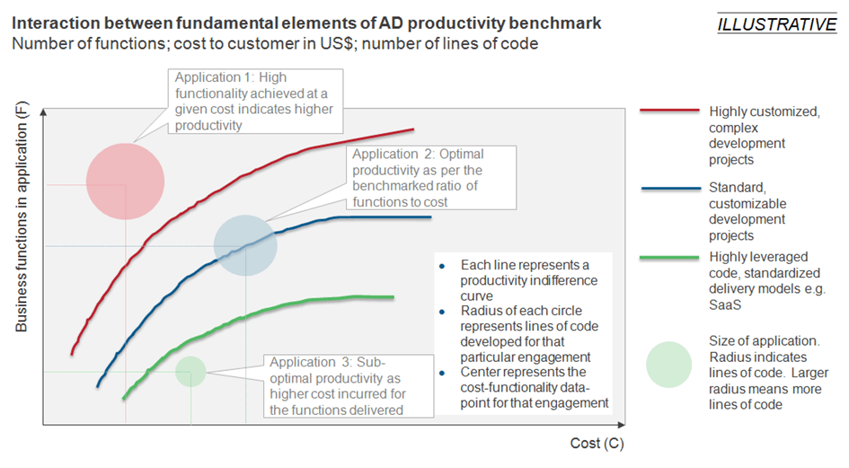
Fortunately for them, data indicates that “business functions versus cost” can be useful in benchmarking the productivity of any application development project. As the following image illustrates, for AD projects of specified complexity and type, a combination of the number of functions (F) in an application and the cost (C) to acquire that application can be plotted into an “indifference curve.” An indifference curve is a graph showing different bundles of two variables between which a consumer is indifferent. Basically, all points on the curve deliver the same level of utility (satisfaction) to the consumer.
Based on benchmarking data over many years, all points that form these indifference curves deliver an optimal level of productivity for the complexity specified.
This productivity benchmarking can be used to assess and optimize the productivity of AD projects. For instance, if a particular AD project, for example application 3 in the above image, falls below its indifference curve, it is delivering sub-optimal productivity. Thus, by using this method of benchmarking, a buyer can immediately raise a flag with its service provider and force it to either:
- Reduce costs to achieve optimal productivity, or
- Provide more functionality to align the project with productivity indifference curve
This benchmarking tool also delivers benefits to service providers. If their case in point AD project is application 1, which falls above the indifference curve, they: 1) have consumer surplus into which they can dig (i.e., buyers could be willing to more); and 2) can use the data to advertise their higher productivity performance to generate more business and differentiate themselves from their competition.
We’d love to hear your thoughts on this type of productivity benchmarking. Have you employed it? What lessons learned can you share with your peers?


