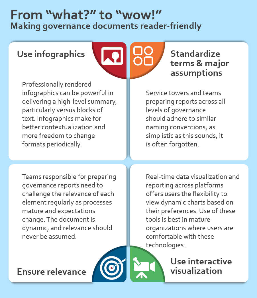
In an industry that has changed dramatically over the past decade – expanding beyond a handful of countries, Global Business Services (GBS) pulling together services across an organization under a single umbrella, “as-a-service” delivery models, autonomics and service delivery automation, etc. – one would expect to be hard-pressed to find a component that hasn’t kept pace.
However, one key enabler of effective ongoing client/provider governance has changed little, if at all.
Across the layers of governance, there are multiple monthly and quarterly reports that provide the basis for regular review meetings. But a comparison of governance reports generated over the past year with another set (across different relationships) from close to 10 years ago revealed no major discernible difference in the messaging, format, structure, or – to an extent – the content of the reports. The profound impact of digital and user experience-driven visualization appears to have eluded them altogether!
Some of the issues that were evident in the majority of the cases included:
- High on data, low on context: As a central theme, most reports have too much upfront data with minimal context behind it. “All green” metric performance is never a guarantee of client or provider satisfaction. Honest and open context actually helps avoid uncomfortable situations during discussions.
- Inconsistency of structure across towers: In multi-tower engagements there are often inconsistencies in simple elements like type of charts and terminology used, which increases risk of miscommunication between client and provider.
- Lack of coherence across governance layers: At times, there was lack of coherence and linkage between operational level governance reports and executive/management-level reports for the same outsourcing engagement. Even straightforward items such as FTE numbers and team descriptions failed to tie up in several cases.
- Resistance to evolution: Even if the entire service delivery has gone through multiple iterations of change, the reporting philosophy seems to be the same in Month 6 and Month 48. Just changing the month-to-month line items containing the metrics is not enough.
All this equates to a lot of time and effort utilized in going through data, with some important subjective discussions being lost or pushed to subsequent follow-up sessions. This can cause a high risk of misalignment in objectives and a potential trust deficit. The situation is aggravated if there are new stakeholders inducted into the governance structure who may interpret similar data in different ways!
Quick fixes
As a principle, any document intended for circulation to a group of stakeholders should be clear in its objective and explanatory enough for an uninformed reader to understand. It needs to foster honest, engaging discussions, and must be modular enough to avoid re-work in bringing together reports for consolidation.
Some easy to implement practices to consider include:
- Use infographics in the executive summary: It might sound radical, but professionally-rendered infographics can be powerful tools to deliver a high-line summary, as compared with lines of text. They also make for better contextualization and more freedom to change formats on a periodic basis.
- Standardize terms and major assumptions: All service towers and team members preparing reports across the levels of governance should adhere to similar naming conventions. While this appears to be a simple thing, it is surprising to see how often it fails to happen in real life scenarios!
- Apply the relevance thumb rule: Teams responsible for preparing these reports need to regularly assess the relevance of each element for the intended audience, particularly at given moments in time. For example, very detailed incident or missed SLA analyses may be needed for operational governance reports during the stabilization period, but post stabilization, the focus needs to change to other priority areas
- Explore interactive visualization tools like QlikView or Tableau: Organizations have started adopting use of real-time data visualization and reporting across platforms like desktops, mobiles, and tablets. This provides users with flexibility to view dynamic charts based on their preferences. Providers supporting services to mature organizations in which users are comfortable using such tools may want to explore using them to buoy their governance reporting capabilities.

Some of the most conservative companies have had to modernize the structure and layout of even their Annual Reports to keep them relevant and more aligned to changing communication needs. The global sourcing industry should take the cue and look to infuse some change into the very documents that form the basis of their ongoing relationship health assessment!


